Farbe ist mehr als ein Natureindruck, mehr als Abstraktion
Was verknüpfen wir mit Farbe?
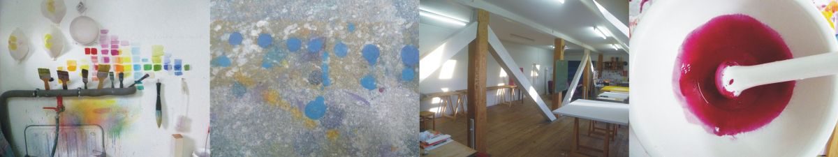
Farbwahrnehmung vollzieht sich meist unbewusst. Die bewusste Nutzung von Farbmacht findet heute besonders durch die Produkt- und Markenwelt statt. Farbe soll subtil unsere alten Hirnteile aktivieren, ohne dass wir merken, was wir mit bestimmten Farben verbinden. War Magenta als Purpur einmal eine kostbare Farbe, die Potentaten vorbehalten war, ist sie heute mit Telekommunikationsprodukten und neuerdings auch politischen Parteien verknüpft. Diese Verknüpfungen legen sich über unsere Wahrnehmung von Magenta.
Schon früh hat mich der Gedanke fasziniert, dass Farbe nur in einem Bild Freiraum bekommt. Durch meine Farbbildsprache möchte ich Verknüpfungen schaffen, die auf ein Surplus von Farbe aus sind, die das Lebendige der Farbe zeigen, das ich erlebe: Die Potenz der Farbe, eine ‚Terra incognita‘! In meinen großformatigen Leinwandbildern sehe ich, wie aus einem Farbraum dynamische Formen auftauchen und sich aus dem Untergrund lösen. Es scheint mir, als würde Farbenergie aus dem Bild heraustreten: ein schwebender, amorpher Zustand, manchmal zart, manchmal kraftvoll, als wäre die Farbe selbst gestaltbildend und lebendig. In der Farbbegegnung von Zinnober und Magenta ist eine subtile karminrote Kreuzung zu sehen. Zinnober setzt eine Grenze, Magenta scheint darüber hinaus; dazwischen balanciert Karmin. Das Lebendige an der Farbe ist für mich das, was ein Bild ausmacht, das aus Farbenerkenntnis gemalt ist.
Colour is more than just a natural impression, more than abstraction
What do we associate with colour?
Generally the perception of colour is unconscious. Today the conscious use of the power of colour is particularly obvious through the world of products and brands. Colour is meant to exert a subtle infl uence on our brain without us actually noticing what we associate with certain colours. As purple, magenta was once a sumptuous colour reserved for those in power, whereas today it is associated with telecommunications products and, as of recently, political parties as well. These associations impact how we perceive magenta.
At an early stage I used to be fascinated with the idea of colour only having space to develop within the confines of a picture. With my own language of colour, I seek to create associations directed at a surplus of colour, thereby illustrating the vitality of the colour that I experience: the potency of colour, a ‘terra incognita’! On my large canvasses I see how dynamic shapes emerge from a coloured space and become detached from the background. To me it is as if colour energy exudes from the picture: a floating, amorphous state, at times delicate, sometimes powerful, as if the colour itself is vital and actively structuring. In the encounter between cinnabar and magenta there is a subtle crossing of crimson. Cinnabar sets a border; magenta radiates over and beyond, and in between them both is poised crimson. To me, the vital aspect about colour is that which makes a picture what it is, painted from an understanding of colour.
Newsletter
Wenn Sie bis hier schauen, dann lieben Sie Kunst Magie aus dem Licht der Farbe.
Abonnieren Sie meine Kunst News und lassen Sie freilassende Kunst noch tiefer wirken.